
The smartphone landscape is no longer a uniform field of phone screens. With the rise of tablets, Chromebooks, and foldable phones like the OnePlus Open and Samsung Galaxy Z Fold 5, developers now face the challenge of crafting apps that adapt and deliver a seamless experience across a vast spectrum of screen sizes and orientations.
Below, the Monedata team is delving into the world of responsive and adaptive layouts to help you overcome common challenges and build amazing apps for all users and devices.
New display canvas
The mobile device market boasts impressive screen sizes and form factors. From the compact world of smartphones (think sub-6 inches) to expansive tablets exceeding 10 inches, users expect apps to function flawlessly regardless of their chosen device. And cross-platform capability is even more important if you want your app to be a success.
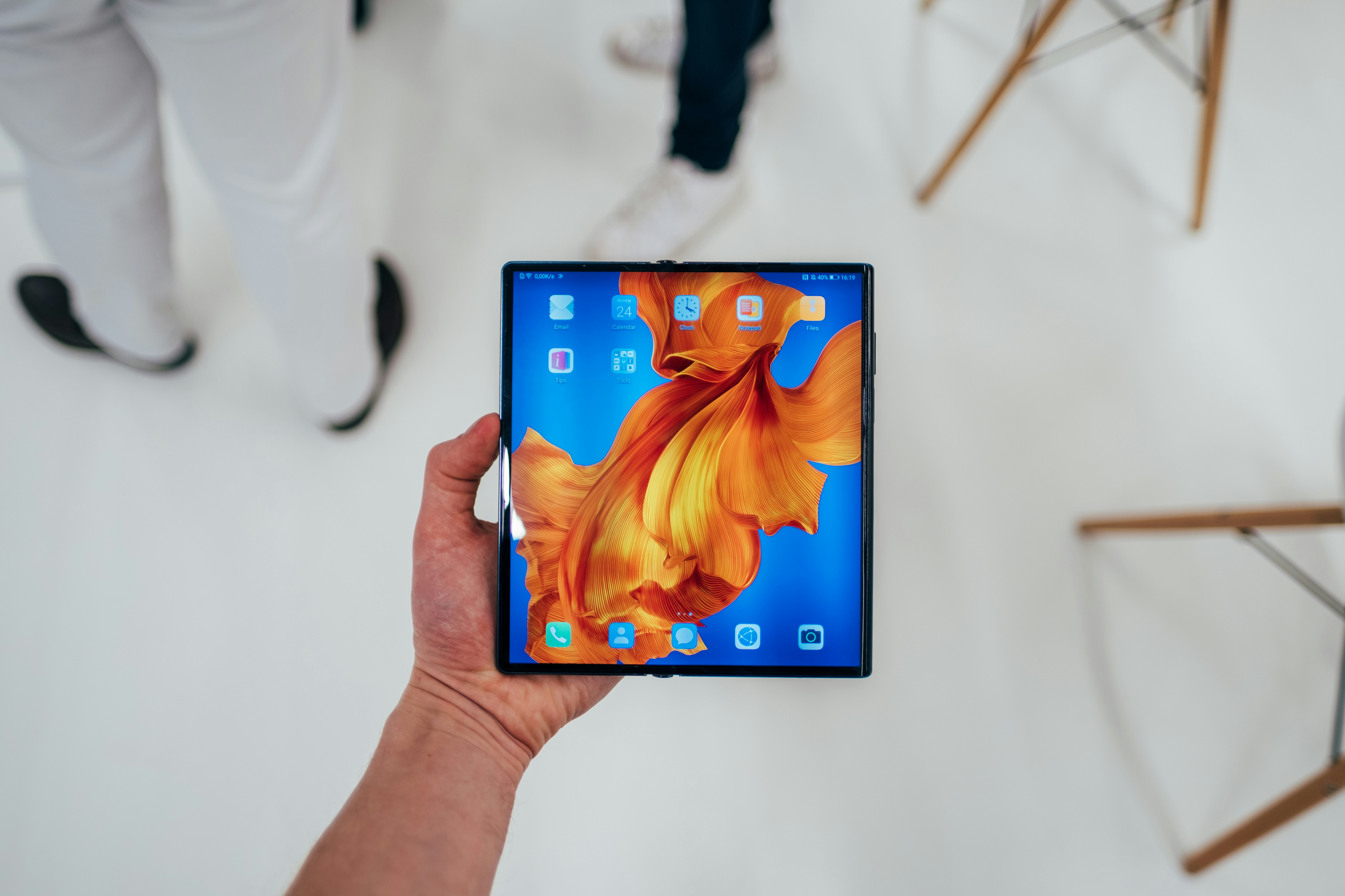
Foldable phones add another dimension to the equation. These innovative devices reveal a tablet-sized screen, blurring the line between phone and tablet experiences. Though they look good, they can be a challenge to develop and require some additional attention.
Here are the key display categories you need to consider when developing a new app:
- Smartphones: The dominant force, ranging from compact to "phablets", pushing the size boundaries.
- Tablets: Offering a larger canvas for content consumption and multitasking.
- Foldables: A new breed that unfolds to become a tablet-sized device.
- Chromebooks: Laptops running Android, requiring desktop-like app layouts.
Responsive vs. adaptive
For most developers, two fundamental approaches emerge for building responsive apps: Responsive layouts and adaptive layouts. Responsive Layouts are the “flexible layouts” that react to the available screen size. They typically utilise a single codebase that adjusts its elements based on screen dimensions. This approach is ideal for simpler layouts that can scale effectively across different sizes and reduce development time.
On the other hand, Adaptive Layouts represent a more granular approach, where you design and implement multiple layouts specifically for different screen sizes and orientations. It offers greater control over the user experience on each device type. While requiring more development effort, this approach is perfect for complex layouts or situations where a radically different UI makes sense for a particular form factor (like a foldable phone in unfolded mode). You’ll find more information on this development type on the Jetpack site.
Material design
Material Design 3 from Google provides a robust foundation for building responsive UIs.
MD3 offers pre-built components and layout templates that adapt seamlessly across various screen sizes. As an Android app developer, this not only ensures you’re offering a great user experience and can deliver a coherent and cohesive experience but also saves you time.
ConstraintLayout is a powerful layout that simplifies building responsive UIs by allowing you to define relationships between elements based on their position on the screen.
Window-Size Class API, on the other hand, can help you detect the size category of the device your app is running on (compact, medium, large, etc.). This information can trigger layout changes based on the available screen space. Finally, think about Responsive Font Scaling, which ensures that text elements adjust their size appropriately across different screen sizes, maintaining readability. Don’t underestimate the importance of accessibility.
Developing for foldables
Foldable phones present a unique challenge and opportunity. It’s essential that your app can resume seamlessly in either the folded or unfolded state, remembering the user's interaction point. Continuity Canvas from Google can be helpful if your app utilises a single-screen layout, allowing it to be designed to adapt and flow visually when the phone unfolds.
For complex apps such as an accounting or stocks and shares app, consider layouts that utilise both halves of the unfolded screen, offering functionalities optimised for the larger canvas. Some developers charge more for ‘foldable exclusive’ features that leverage more screen real estate and as foldables become ever more common, the market size increases.
Testing
Building responsive apps requires a robust testing strategy. The good news is that the market has tools and features to make this process more straightforward. For example, Android Studio's Layout Editor can be used to preview your layouts on various screen sizes and orientations, catching potential issues early on. Emulators and Physical Devices should also be used to test your app and identify any screen size-specific bugs.
Finally, get real users with different devices to test your app and provide feedback on the responsiveness and overall experience. Beta testing is a great way to improve your UX.
Wrapping up
The landscape of screen sizes and form factors is constantly evolving. By embracing responsive and adaptive development practices, you can future-proof your apps and ensure they deliver an exceptional user experience regardless of the device. If you’re looking for new ways to monetise your Android app, Monedata has you covered. Get in touch today.


Comments