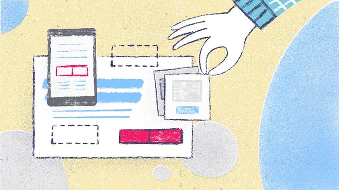
A complete guide on how to create a landing page that coverts visitors into users of your app. It includes a downloadable checklist to help you.
The difference between a web page and a landing page is that, the first one has several functions, and the second only one. A landing page is a single page created with the purpose of making a visitor react in some way, such as purchasing a product or service, subscribing to a newsletter or, in our case, downloading our apps.
There are many marketing platforms that offer this service, or you can create it yourself. Whichever option you choose, here are some tips for designing an effective landing page.
Simplicity is your ally.
Your landing page should be simple, with only the essential elements, clear in what is offered and with all the information and download links on the first screen, without having to scroll to find them.
IMPORTANT: Submit a single call to action and a single offer to get it. Avoid confusing your audience.
Make it easier for your online readers by making the page easily scannable. Create contrast by using color and size to bring them to the most important part, which is the call to action, in this case, the download links.
If your app is difficult to explain or has many functions, take advantage of the bottom part of the fold to develop the texts. You can add the download links again at the end.
Your page should load very fast.
Every second of delay in loading a web decreases the possibility of conversion rate. If your page loads very slowly, you can use Google’s Page Speed Insights to see what problems you may be having and fix them.
Use the psychology of color to your advantage.
Color affects human behavior. And although this is not an exact science, since each individual has personal preferences and even associations related to his cultural background, it is worth analyzing the general trends to apply them to our project.
At a general level, colors have certain associations, such as blue and trust, yellow with energy, red with strength, or green with freshness. Follow the lead of the big brands and use this knowledge to your advantage.
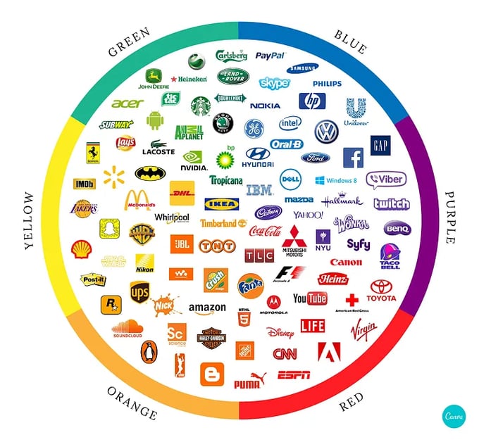
Color psychology: The logo color tricks used by top brands & how to DIY by Canva
You can go deeper into this topic in the following article: How to Use the Psychology of Color to Increase Website Conversions
Choose the correct font.
Typography is at the service of the content and should not distract from it.
Its purpose is not only aesthetic, it is also functional: some fonts work better in titles and others facilitate a clear reading in paragraphs. Without forgetting this, you can always risk a little more in the typography of the titles and choose a clearer and simpler one for the paragraphs. This creates a certain hierarchy and contrast in your texts to help guide the reading or draw attention to certain portions of the text.
TIP: It is important to consider the number of international symbols that a typeface includes, especially if you are translating your landing page into multiple languages. Consider as well the weights that it includes, you will have more design options.
Finally, think about what you want the typography to say. Look for fonts with an aesthetic that fits your project.
You can go deeper into the subject in the following articles:
Choosing Web Fonts: A Beginner’s Guide by Google Design
How to Choose the Right Font for Your Website from Qode Magazine

Photo by Brett Jordan on Unsplash
Write a compelling headline.
Your headline is the first thing a visitor to your website will read. You should get their attention and make them curious enough so that they want to stay and read the rest. Take advantage of your headline to present your offer or the benefits you provide.
Your headline should be a mixture of keywords that clarify what your landing page consists of, and emotional elements that increase the chances of downloading your app.
This tool analyzes your headline and gives you information on its effectiveness, it is free but requires you to create an account.
Your texts must communicate the message clearly and effectively.
Copywriting consists of writing persuasive texts for visitors to take an action, in this case, downloading your app. When writing your texts, highlight the value of your app, make clear its benefits and advantages.
TIP: Ask yourself three questions to prepare your text.
· Who is my ideal user?
· What problem or need do they have?
· How does my app solve or satisfy their problem or need?
Once the problem or need of the potential user has been identified, also called pain point, talk about it, but focusing on the positive part, which is the solution you offer. Do not confuse benefits with the features of your app when writing your copy.
Use bullet points and short paragraphs, make it easier for your audience to read your texts.
If you get your text to establish an emotional connection with the visitor of your landing page, and that they imagine enjoying your app, it is highly likely that they will become a user.
To know more you can read Copywriting 101: 6 Traits of Excellent Copy Readers Will Remember.
In addition, when writing your texts you should consider SEO (Search Engine Optimization) positioning to increase your chances of appearing as high as possible on the search engine results page.
Working on the SEO of texts is an extensive and complex subject. But to get started in an easy way, focus on choosing relevant keywords and use them in the URL or web address, in the headings and in the text, especially in the first paragraphs.
Use Google’s keyword planner to see what keywords are being searched for by your potential users.

Photo by Kaitlyn Baker on Unsplash
Use click triggers.
Click triggers are designed to eliminate the last doubts to convert a visitor into a user of your app. They are expressions such as “No commitment” or “Unsubscribe Easily”, or actions such as adding privacy policies to demonstrate that your app is safe, or to quote a satisfied user.
Optimize your website for mobile devices.
One effective way to get new users through your landing page is for it to be visited comfortably from mobile devices so that direct downloads can be produced. Your page must be responsive and work perfectly, as well as being just as eye-catching and effective as on a computer screen.
Choose images and videos that show the benefits of your app.
Generic images are very pretty, but very impersonal. Show satisfied users using your app, show its features. As with your texts, your images must generate empathy to convert a visitor into a user, they must show value.
TIP: Explainer videos increase the chance of visitors downloading your app. These videos build trust by introducing your app by a person, introducing your team, showing your workspace … They humanize it.
Add positive reviews and testimonials.
Show other users pleased with the use of the app. Seeing other people use it builds trust and proves that the app keeps the promises it makes.
This extends to any other social proof, such as blogger reviews, media in which you have appeared or brands you work with.
Include social share buttons
Make it easy for your landing page to be shared, encourage visitors to share it and recommend your app.
Make an offer or give a discount.
Or some advantage for downloading the app from your landing page. Include a certain sense of urgency, something that gives the impression of scarcity.
Analyze your Metrics.
This will help you know if your tactics are working or if you need to adjust something. Measure more often at the beginning to find out what works and what doesn’t.
The most important metrics are the page views, the source of your traffic, submission rate, bounce rate and form abandonment or how many people reach the download page and do not download the app.
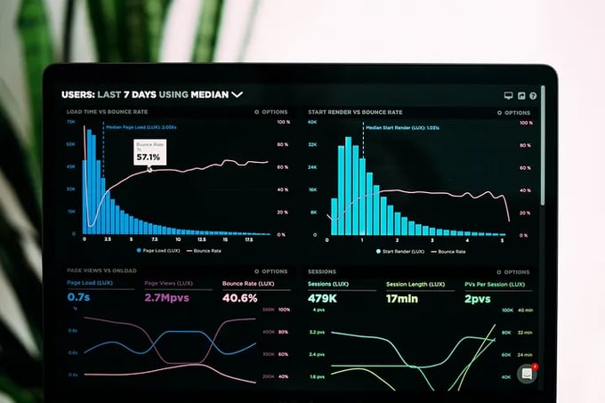
Photo by Luke Chesser on Unsplash
A good landing page can help you generate a significant increase in users. You can also use it to direct them from social networks or a newsletter. Try designing several different landing pages, not only will it give you more options, but it will also allow you to try different things to find out which one works best.
We have prepared a checklist for you to help you design your landing page.
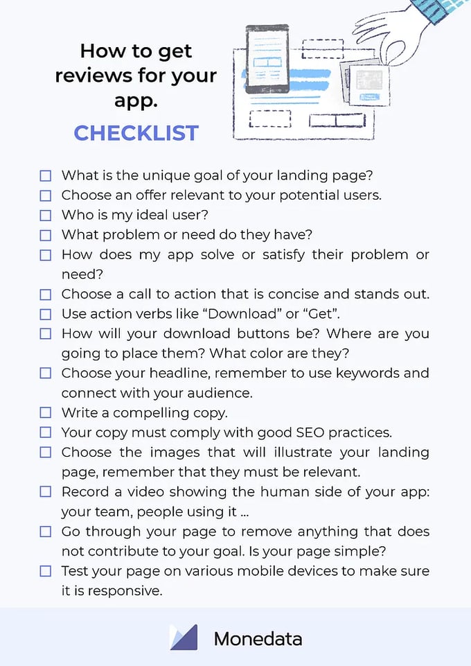
BIBLIOGRAPHY:
17 Tricks for Boosting Conversions On Any Landing Page: https://www.jeffbullas.com/17-tricks-for-boosting-conversions-on-any-landing-page/
15 Tips To Help You Create An Effective Landing Page: https://marieennisoconnor.medium.com/15-tips-to-help-you-create-an-effective-landing-page-881a7e690b14
Build Landing Pages that Convert with These 3 Smart Steps: https://copyblogger.com/build-landing-pages/
12 benefits of landing pages for content marketing: https://www.brafton.com/blog/seo/12-benefits-of-landing-pages-for-content-marketing/
The Ultimate Guide to Landing Pages: https://blog.hubspot.com/marketing/landing-page-best-practices?utm_campaign=Marketing%20Blog%20Weekly%20Email%20Sends&utm_source=hs_email&utm_medium=email&utm_content=75658161
Illustrations by Monica Galan





Comments